12 Gorgeous Living Room Paint Colors to Try
Paint is the cheapest, highest-impact change you can make to a living room, but it’s also the one people agonize over longest, since a color that looks perfect on a small swatch can read completely differently across four full walls. These twelve colors are ones that consistently work well in real living rooms, not just paint chip photography.
1. Warm Greige
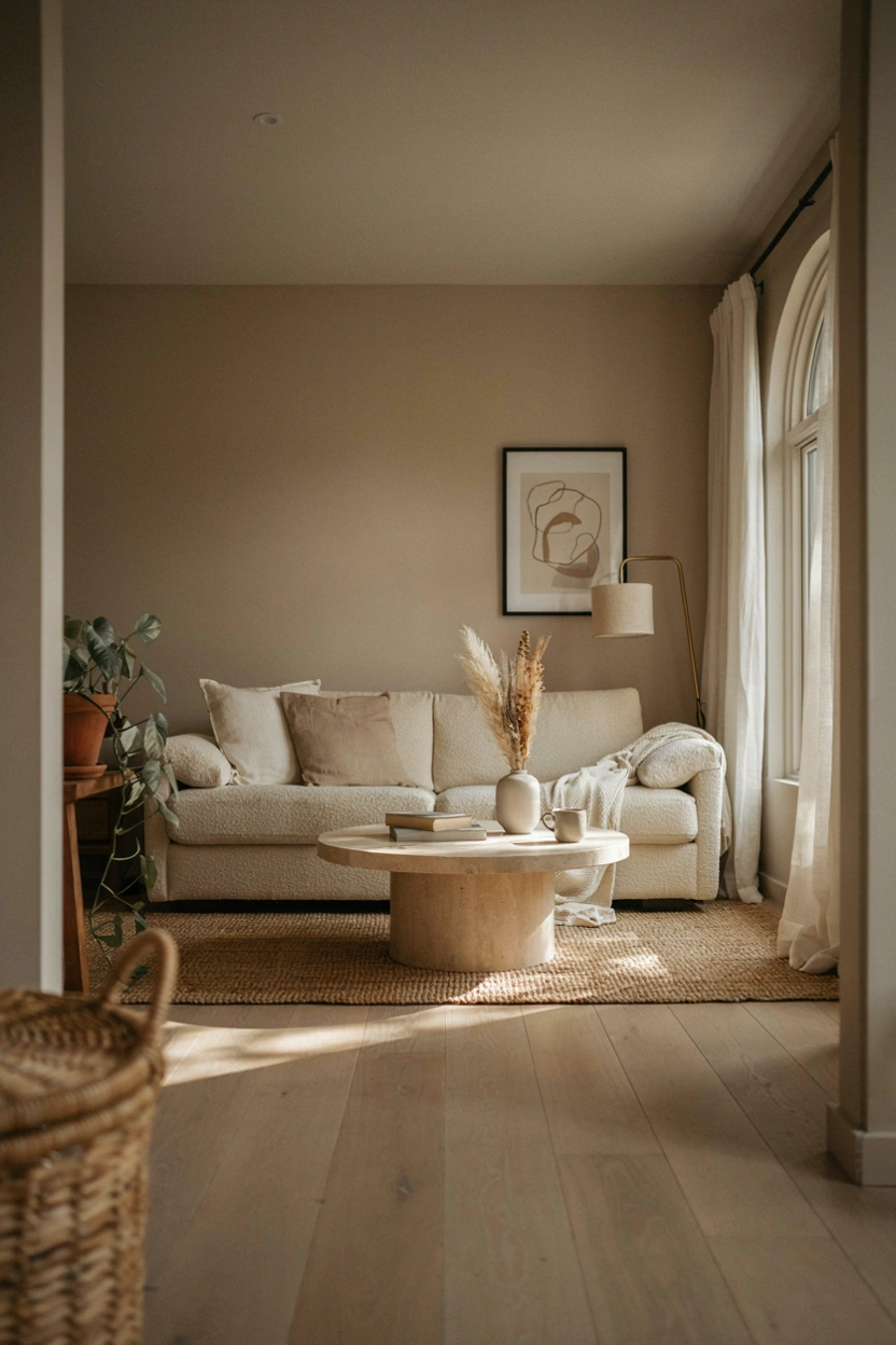
A warm greige, a gray with noticeable beige undertones rather than a cool blue-gray, remains one of the safest and most flattering neutral choices for a living room, since it reads as sophisticated without feeling cold. It works particularly well in rooms with strong natural light, where a cooler gray can start to look flat or clinical by midday.
2. Deep Forest Green
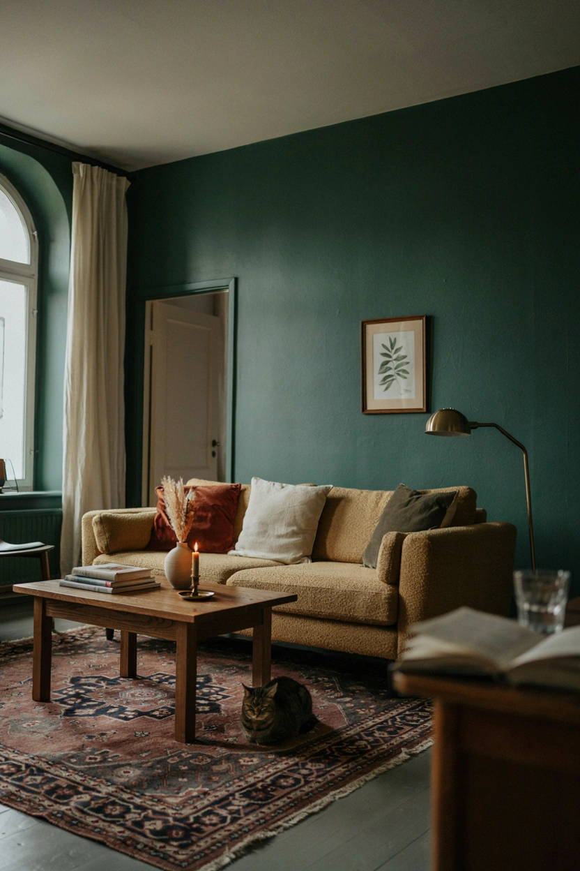
A saturated forest green brings genuine drama to a living room while still reading as timeless rather than trendy, since deep greens have been a design staple for decades. This works best as an all-four-walls commitment rather than a single accent wall, since the color needs to wrap the room to feel intentional rather than isolated.
3. Soft Terracotta
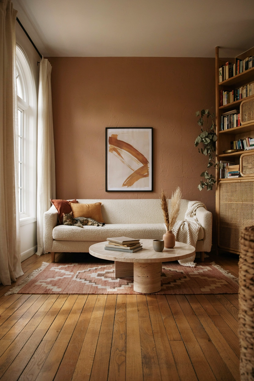
A muted terracotta, closer to warm clay than bright orange, adds genuine warmth to a living room without the intensity of a fully saturated color. This tone pairs especially well with natural wood furniture and woven textures, making it a strong choice for a room already leaning into an earthy, organic palette.
4. Classic Warm White

A warm white with a slight cream or yellow undertone, rather than a stark cool white, keeps a living room feeling bright and open while avoiding the sterile, gallery-like feel that pure white can create in a lived-in space. This is the safest choice on this list for anyone planning to sell in the next few years, since it appeals to the widest range of buyers.
5. Muted Navy
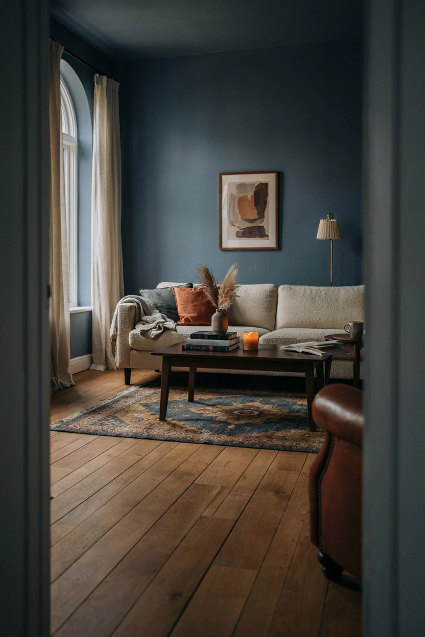
A softer, slightly muted navy rather than a stark, bright blue creates a genuinely cozy, enveloping feeling, especially effective in a living room used primarily in the evenings. Pairing it with warm brass or gold accents keeps the overall effect feeling rich rather than cold.
6. Warm Taupe
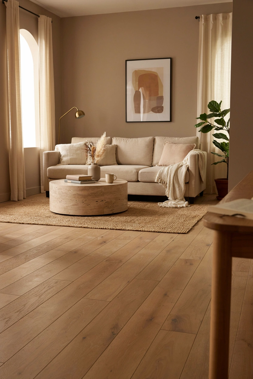
Taupe sits between gray and brown, and a warm-leaning version works as a genuinely versatile backdrop that complements nearly any furniture color or style, which makes it a reliable choice if you tend to change up decor and don’t want to repaint every time.
7. Dusty Sage Green
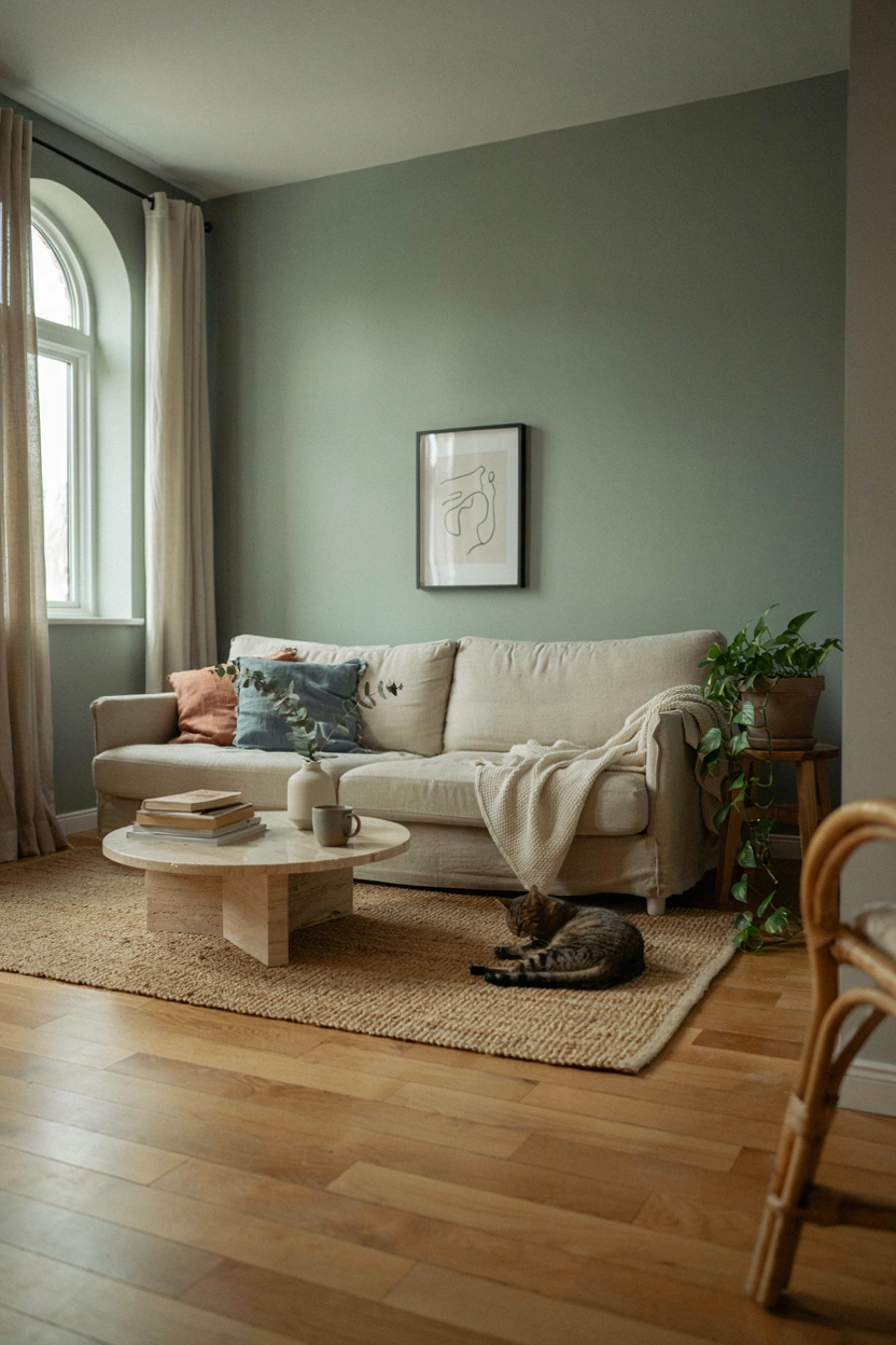
A muted, grayed-down sage reads as calm and organic without the intensity of a true forest green, making it a gentler option for anyone wanting color without a dramatic statement. This shade tends to shift subtly throughout the day as natural light changes, which many people find adds real character rather than feeling flat.
8. Rich Charcoal
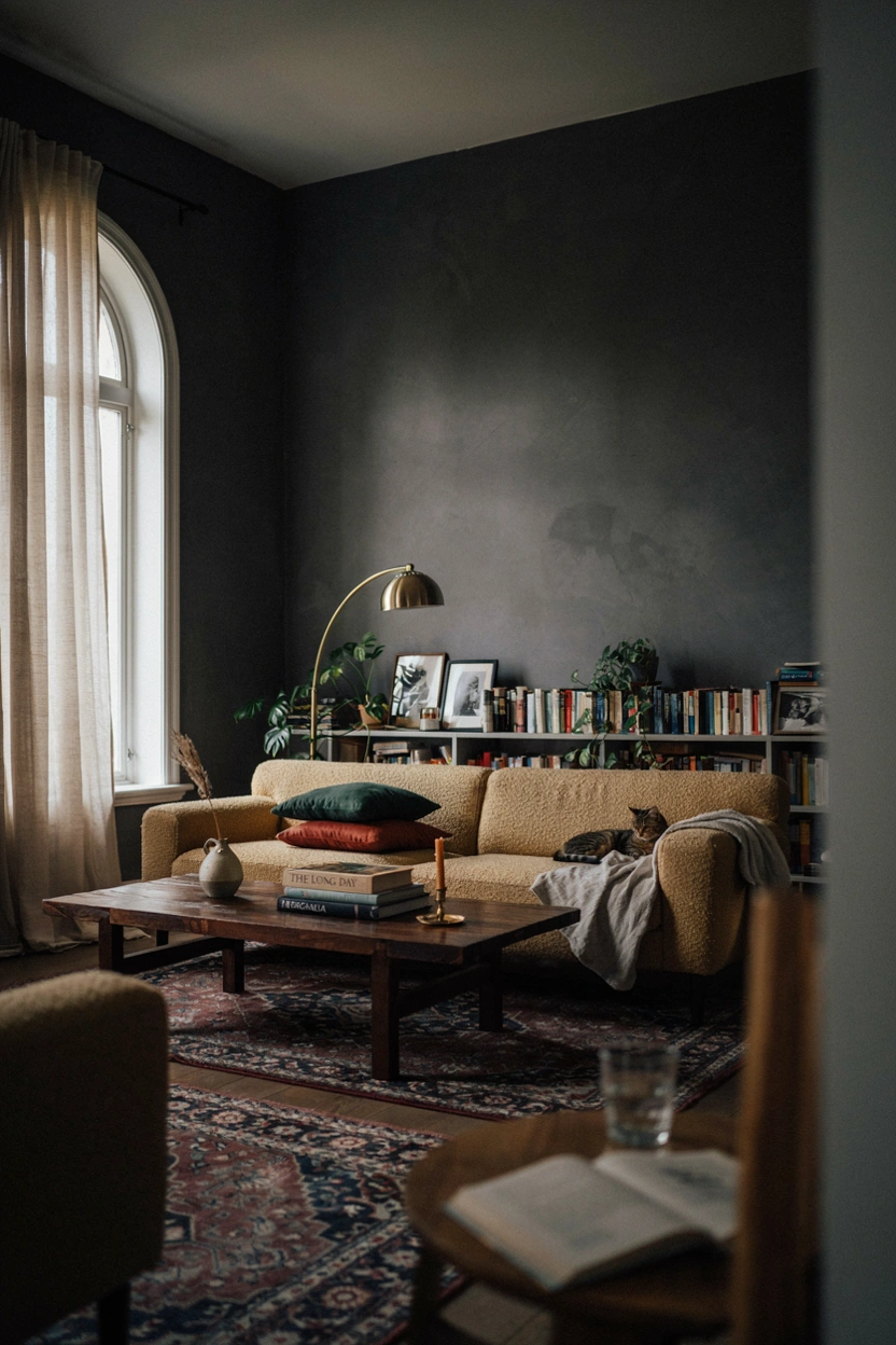
A dark charcoal, just short of true black, creates a genuinely dramatic, cocoon-like living room that photographs beautifully with warm lighting and gold or brass accents. This works best in rooms with strong natural light or supplemental lighting, since a dark charcoal in a poorly lit room can feel oppressive rather than cozy.
9. Warm Blush
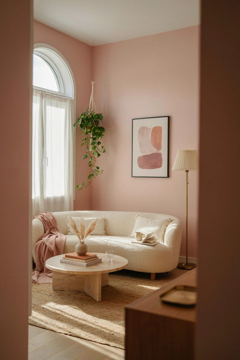
A muted, warm-toned blush, closer to dusty rose than bright pink, has become a genuinely popular sophisticated neutral alternative, working especially well in a living room leaning toward a softer, more romantic overall style.
10. Olive
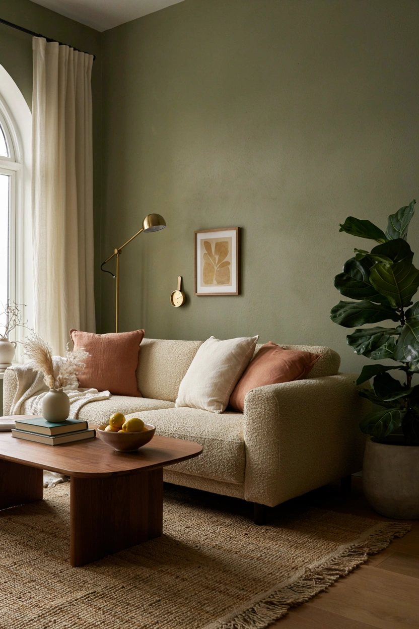
Olive sits at the intersection of green and brown, giving it a genuinely earthy, grounded quality that pairs beautifully with warm wood tones and natural textures. It reads as more sophisticated and less playful than a brighter green, making it a strong choice for a living room aiming for a calmer, more mature palette.
11. Soft Butter Yellow
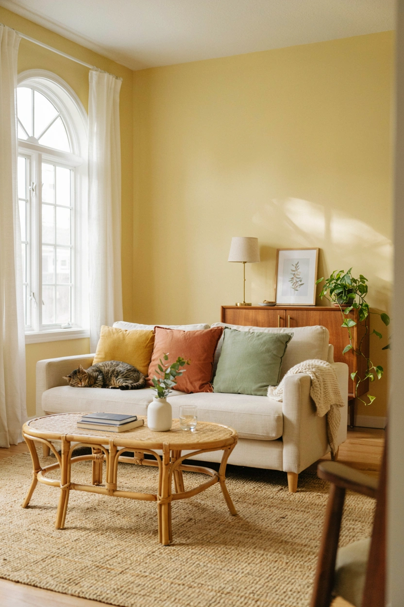
A muted, soft yellow brings genuine warmth and cheer to a living room without the intensity of a brighter, more saturated yellow that can feel overwhelming across large wall surfaces. This works particularly well in rooms with limited natural light, where it helps compensate for the lack of actual sunshine.
12. Deep Plum
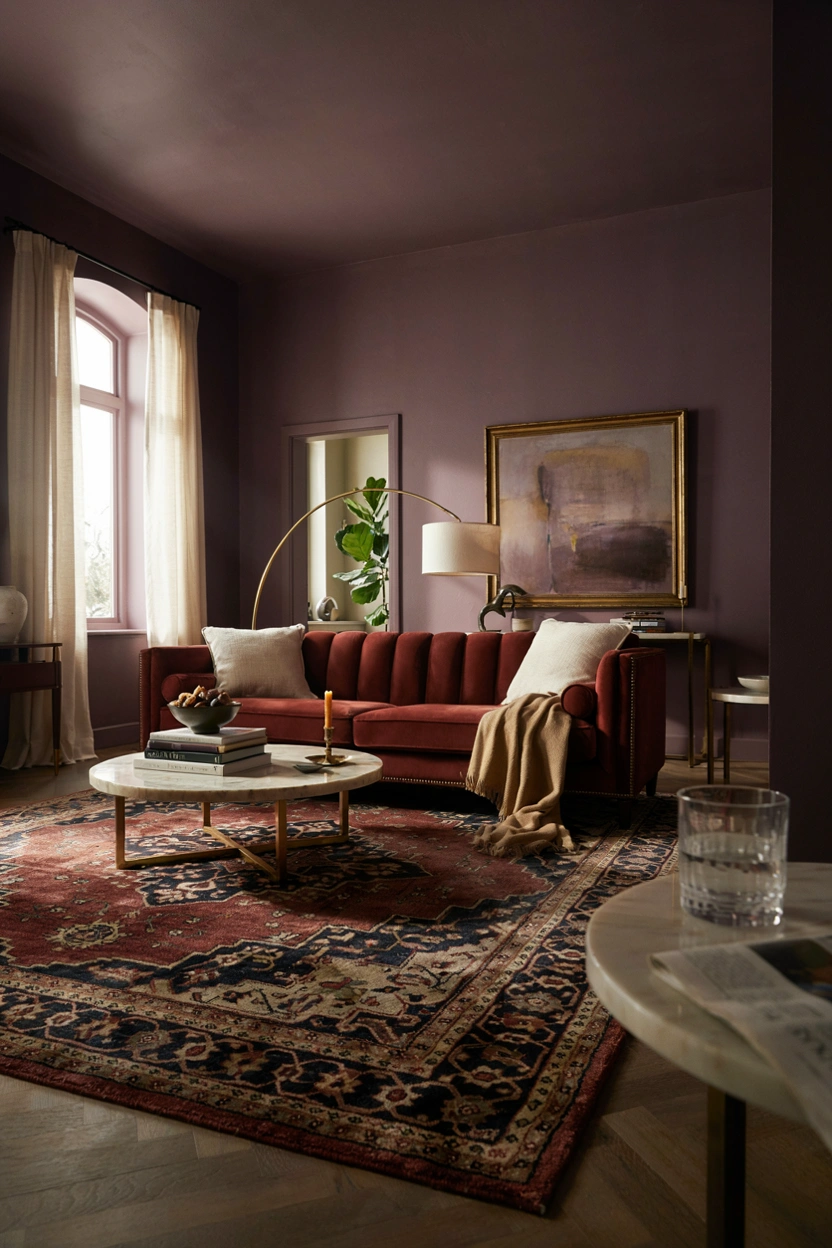
A deep, muted plum brings genuine richness and a slightly unexpected sophistication to a living room, working especially well as an evening-focused space where the color’s depth feels intentional rather than overwhelming.
If you’re testing colors before committing, paint a large sample directly on the wall rather than relying on a small chip — colors shift noticeably once they’re covering real square footage under your room’s actual lighting.
More Home Ideas You’ll Love
Keep exploring with Glass Partition Ideas for Open Living, TV Wall Ideas to Transform Your Living Room and Modern Accent Wall Designs.